
i love itDDDDD


i love it

This 3D thing looks nice, but one strength of SE is the nice cards. I hope they will be a bit bigger somehow without having to rollover them.
Grand Watchman of the Ancient Blue Citadel
Warriors of the Blue Phoenix
Greatness, Reborn.
Don't just witness the greatness;
Stride with us.
To join the demonstrably greatest guild in the history of Shadow Era - click here

+1 to danae...but honestly I really feel the background Heartstone-ish and the targetting lines Duels of the Planeswalker-ish... I hope the mobile version remains the classic...Originally Posted by danae

What happened to the voice of the heroes?
Shadow Era:
Every Turn Counts
"Being strong isn't just about having powers or moves...It is about HEART." - Roronoa Zoro, One Piece
PFG 2 Member "You idealize, we criticize."
1st Singapore Meltdown Physical Tournament Winner
IGN: Berdugo ETC
Profession: Alien Hunter

I really hope we are able to choose between this layout and the classic.
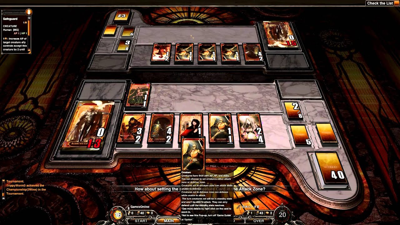
Myself, as a fairly new player, would just simply like a revamped and more thought out version of the way things are now. The new design makes it feel like a completely different game and wastes a lot of space, while removing things that kept the game simple and nice. I personally do not feel that the current board has any features that are extraneous and is quite simple and clean. I hope that the devs can keep the board like it is now.
I don't agree with really any of the criticisms that I've read. Having the hero in the center really makes the game feel more confrontational with is good. And a lot of the criticisms don't make much sense to me. I don't mind a HS-esque UI because it makes it easier for HS players who get sick of all the imba in HS constructed to cross over into Shadowera.
I love the direction its going in! Especially that the full cards where kept for the hero, weapon, and armor!
I cant wait to see more!!
Nashville, TN area SE Champion

..pretty much all has been said by now, but i also want to add that i do not like the direction this is heading in - not because its new, but because it just looks weird and definitely not thought through very well (at least so it appears to me, no offense please).
i myslef often play on iPhone and i really do not see this working for mobile users, seriously. as one example i will just say that while the cards in your graveyard (that most heroes do not use, like EVER) is a size of the Hero, while i can barely see the cards in hand in your video (ones that i know i need, always, no matter what), and thats a video from a pc screen, cannot imagine playing this on mobile without having to use magnifying glass
...another thing i am not able to figure out is how will 2-v-2 work if this is implemented
..not that i feel that the community is being listened to here, i just wanted to share my impressions and thoughts
if i had a chance to affect this change in any way, i would also go the simplistic way of upgrading the 'table-like' interface we currently have (..of do it "MtG-like" if you will). its nice, its simple, its functional, it works good on mobile devices (even on those with tiny screens), it supports the digital-playmat thingie...anything else needed?
..i like to see the game we all like, support and play, being worked on and improved, just dont like the looks of whats been shown to us so far
all of the below ones look (imo) pretty much okay as far as the layout and usefulness go, would really love to see SE going in similar direction as far as the 3D field goes:
..i might even do some sketches later, as long as someone's interested
..however, as many said before me, since some people seem to like this new design-proposal, i ain't gonna rant here, as long as we get one fancy button allowing us to switch between old-style and this new 3D, it's all perfectly fine (heck, i might even give this new one a shot, but more likely no than yes)))
Last edited by 4Ak; 06-03-2014 at 09:54 AM.
"This is who I am, nobody said you had to like it."
TJ 4Ak
Vermilion Bird
The Holy Beast of...
Team Juggernauts

Nice write up 4Ak, the first picture is nice... good inspiration.
Shadow era has the very best card art of all new TCG currently. I think its even better than MTG. So we dont need any super duper nice 3D features... we need simple board fullfiled by cards!!! Those art is amazing, I want to see those images in HD when I look on cards.
If the text will be in HD... so readable without zooming in, it will be even better.
I also love the camera system right now, we can swype on part of board we want to see... And its very easy to implement 2v2 and we can swype to sides...
IGN: TJ Maskee - Proud member of Team Juggernauts !

This greatly concerns me because I feel like taking this step incorrectly could break the game.
I feel like this was made to be 3D purely for the sake of being 3D. There's a lot of space that has no meaning and even the 3D graphics that are there (the green pillar things) don't tie into the game in any way or have any game significance. It's also visually unbalanced (which causes confusion) because I see my deck on one side and a green pillar on the other (where's my opponent's deck? does he have one? why can't I see it?). I'd rather see my and my opponent's Graveyard, Deck, Resources and each card clearly represented. I also worry greatly about the in-play cards losing size on the screen which would make a game which is already hard on the eyes with all the small images and small text nearly impossible to play.
If you were to ever implement a card which said: "The last item target hero played is destroyed", the new system of laying out weapons and armours in a place separate from other items will make this extremely confusing and it will be confusing as is for newer players to understand that these are also in fact 'items' which can be affected in the same way cards like 'Bazaar' are affected.
3D graphics are cute and all but if they take away from the gameplay and the information provided then I'd really consider not using them. I personally enjoy the game laid out like the card games I've always played - a card game is a card game and I like it as such, I don't play hearthstone because it doesn't feel like a card game.
Another note is that if you blatantly copy the same play set up as hearthstone you'll be compared to hearthstone much harder than you are currently and you'll lose because Blizzard has way too much money to spend on graphics. Shadow Era has superior gameplay, beautiful card art, and the game translates seamlessly into it's physical version - those are Shadow Era's strengths and I personally don't think redesigning the placement of everything and adding 3D graphics is the best place to invest in the quality of Shadow Era as a whole.
If going 3D is a must then there are many other design solutions which would look much more similar to the current game which would still enhance the visual quality of the game. Such as 4Ak's post, this is a much better direction to go.
Consider making every graphic have a meaning. Make it relatable to the hero, cards played, lore, etc...
Last edited by Samzyn; 06-04-2014 at 12:44 AM.
Custom Card Design - Warlock Expansion
 Posting Permissions


Bookmarks